


Accessibility standards don’t have to hold back creative work.
As designers, we’re constantly asked to expand our ideas, think “outside of the box,” and transcend conventional solutions. Some designers hear the word “accessibility” and imagine being forced to limit their artistic vision and creative thinking. They perceive accessibility as a box with walls that restrain creative thinking that should be avoided at all costs.
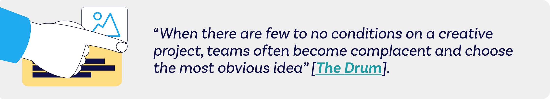
In reality, constraints imposed by accessibility requirements can actually spark creative thinking. Research published in the Harvard Business Review shows that “when there are few to no conditions on a creative project, teams often become complacent and choose the most obvious idea” [The Drum]. It might seem counterintuitive that limitations can help us think and design more creatively. But reframed as opportunities, these accessibility restrictions can lead us to focus more on the overall purpose and to provide the best solution to a design problem.
What Does “Designing for Accessibility” Mean?
Designing for accessibility means designing experiences that people with a variety of disabilities can use. Accessible designs must adhere to the Americans with Disabilities Act (ADA), a civil rights law that prohibits discrimination against individuals with disabilities and provides guidelines for compliance. Initially focused on providing physical access for people with disabilities in public spaces, it expanded into digital spaces as the web’s importance as a communication medium grew.
Although there are no concrete technical standards for website accessibility, there are widely accepted guidelines, like the Web Content Accessibility Guidelines (WCAG), for meeting legal obligations. These guidelines are the ones that most designers refer to when creating digital assets for accessibility.
Designing for Accessibility Promotes a Human-Centered Approach
It’s the designer’s job to understand a client’s audience’s perspectives. Considering creative approaches through a new lens can fuel different ideas to tackle design challenges.
For example, how do you ensure your font sizes are suitable for someone using a screen reader, or that your color palette works for a user in a low-light environment? By designing for these specific scenarios, you gain a deeper understanding of all users. This leads to more universally meaningful design choices.
Designing for Accessibility Forces Clarity and Simplicity
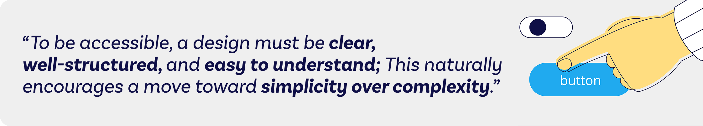
Because the beauty of design lies in its unlimited possibilities without restraint, it’s easy to get caught up in too many details and pretty (but unnecessary) design aesthetics. To be accessible, a design must be clear, well-structured, and easy to understand. This naturally encourages a move toward simplicity over complexity.
The need for straightforward typography, logical information hierarchy, and intuitive user experience all contribute to a cleaner user interface that benefits everyone.
Ignoring Accessibility Costs More in the Long Run
Accessible design is often relegated to a corporate-level concern focused on avoiding lawsuits and bad publicity. If an accessibility lawsuit is filed against an organization, in addition to bearing legal costs, it must also retrofit existing designs to comply with disability requirements. This costly and time-consuming process can be avoided if accessibility is considered from the start of the design project.
The broader justification for accessibility design is that it’s simply the right thing to do.
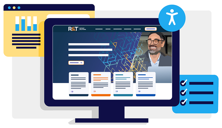
Client Case Study: R&T
R&T Deposit Solutions, a financial services firm, was required to meet WCAG 2.1 Level AA. To address this, Ridge Marketing designed R&T’s information and user interface components so they could be viewed by users with third-party accessibility tools. At the same time, R&T wanted the new brand visuals and color scheme to be tech-forward, characterizing their simple solutions to complex financial problems.
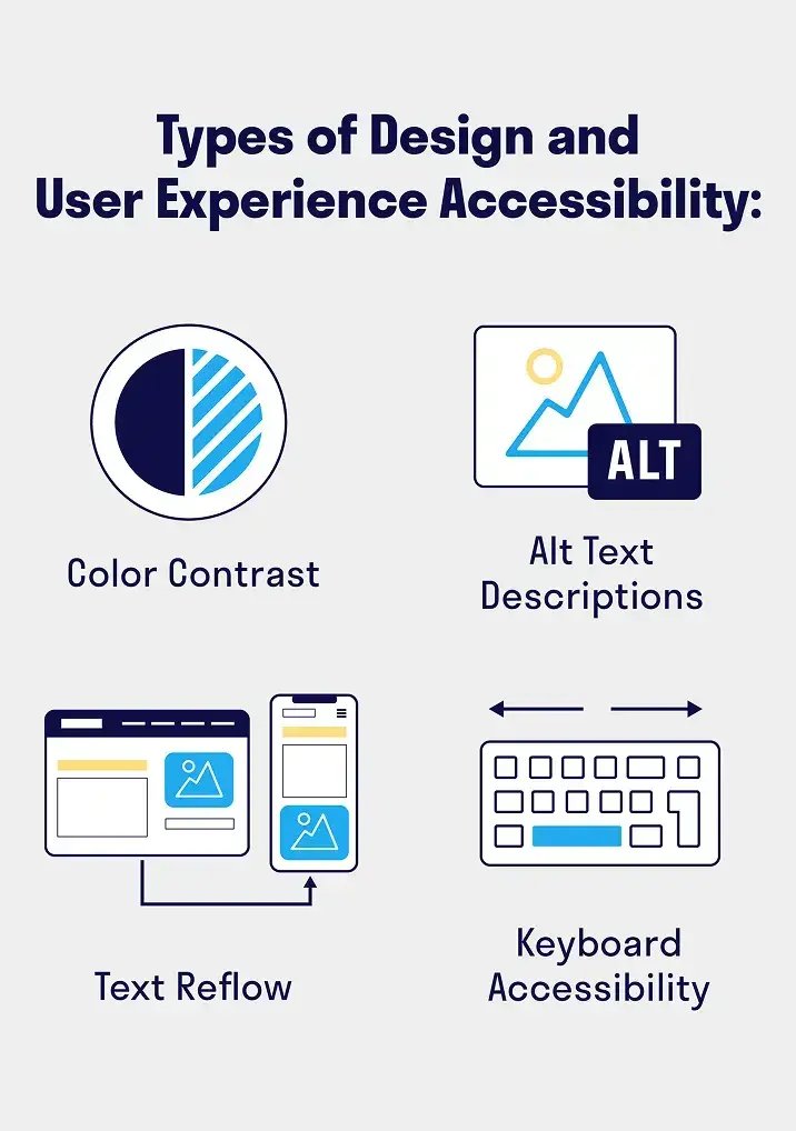
This resulted in the following design and usability choices:
- Color contrast: Ridge created and applied a color palette with a minimum contrast ratio of 4.5:1, ensuring legibility for viewers with low vision or color deficiencies without limiting the creativity of the brand.
- Non-Text Content: All non-text elements, such as photos and icons, had accurate Alt Text descriptions added to their code for third-party screen readers.
- Text Reflow: Web layouts were designed to resize correctly for smaller browser sizes, such as on tablets and mobile devices, while keeping content legible and organized.
- Keyboard Accessibility: All interactive elements, such as links, buttons, and forms, on the website would be fully operable with only the keyboard, without a mouse.
An Invitation for Creativity
The ultimate goal of design is to create something functional in composition and impactful in delivery, resonating with as broad an audience as possible. Designing for accessibility standards shouldn’t be a roadblock to good work. At Ridge Marketing, we see this as an invitation to a more interesting and impactful user experience. It’s an opportunity to push past a surface-level design and create something that is not only visually stunning but also thoughtfully crafted. Not only do we get to create visuals for our clients that look amazing, but we can also help them solve real-world problems and achieve their business goals while ensuring their brand is accessible to everyone.