Steps to Design for Inclusion: Accessibility & Creativity
By Rose Arenas on
“Design should reflect its intended audience.”
Usually, the fundamentals of good design are already inherently accessible, whether you’re talking about color, contrast, or balance. On the other hand, incorporating accessibility as an essential principle sometimes requires creatives to reexamine and adapt their methods to effectively design for inclusion.
When deciding on a color palette for a brand, designing for accessibility requires a designer to pay close attention to the color contrast ratios between the background and text colors. High color contrast has always been important for usability; it ensures that most people will have an easier time reading text.
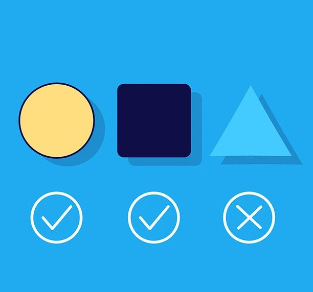
Additionally, color should never be the only way to convey an action or direction. For example, colorblind individuals may not be able to determine a text link from other text just by color alone. By underlining, bolding, capitalizing and/or providing action to the text, there are now more clues to the viewer indicating that this particular text is more important and should be paid attention to.
Quick Tips:
Always use a color contrast checker, whether it’s a plug-in or a website. WebAIM contrast checker is a free color contrast resource that specifically keeps the WCAG accessibility requirements in mind.
Keep the number of colors in a section to a minimum – too much color can make it hard to read.
Any information that is essential to navigate the site needs to have good contrast between the information and its background – this includes colors and any other visual indicators, such as arrows or underlines.
Text Layouts
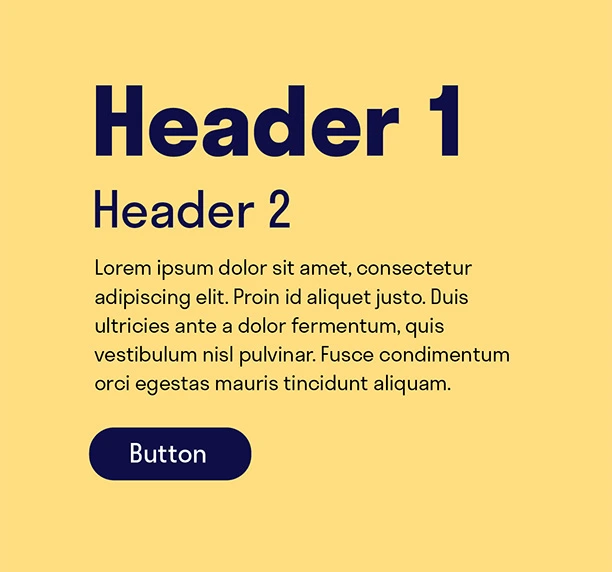
When considering text layout for accessibility, it’s important to organize text into smaller groups with clear linear pathways. Complex layouts are barriers for individuals with low vision, reading issues, and people grappling with ADHD. Missing elements like headlines or tightly spaced letters can often hinder people with disabilities and prevent assistive tools like Text-to-Speech from following the flow of content.
Trying to fit a large quantity of text in a space can also make it difficult for anyone to concentrate and read through. This often causes the visitor to skim text that may be important, or worse, ignore the text altogether. When considering accessibility, it’s recommended to break up large oceans of text into smaller paragraphs or lists so they’re easier to consume, especially in smaller spaces like on mobile devices.
The space between paragraphs, sentences, words, and even letters is just as important. For example, if not properly spaced, the letters “r” and “n” grouped too closely together could resemble the letter “m” (making “yarn” look like “yam”). This can make the text harder to understand.
Quick Tips:
Make sure you pay attention to the hierarchy of your content and use correct headings.
Use left-justified alignment to avoid irregular and odd word spacing.
Use clear and consistent layouts. This includes layouts with text and other media.
For body copy, the optimal number of words per line should be between 45 and 80, including spaces.
Accessible Typefaces
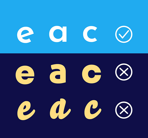
You may love that script typeface with all the loops, but if that font is difficult for a sighted person to read, then it’s definitely a challenge for individuals with cognitive or visual disabilities. When considering typefaces for accessibility, designers should opt for a font that works for all uses, from small disclaimer text to giant headline text.
A common typeface with clear, distinguishable characters will pose fewer readability challenges than an ornate or overly stylized font with single-use cases (like only having an uppercase variety).
Quick Tips:
Choose a readable typeface – Sans-serif fonts are usually more accessible than serif or display fonts.
In most cases, font sizes below 12/13pt are not legible by most users. Use smaller-sized fonts sparingly unless the design calls for it.
Images/Media Alt Text Descriptions
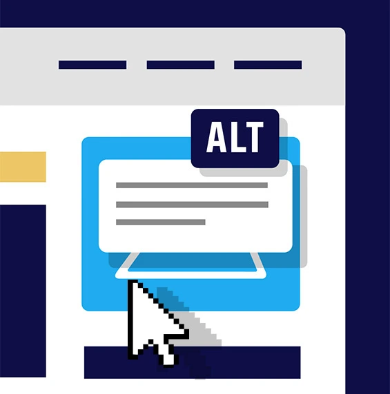
Images play a significant role in design, so those with visual impairments may miss important context if they can’t see it clearly. This means that making text alternatives to visual images and graphics is a minimum to meet accessibility requirements.
This text alternative, or alt text, is a short description that captures the “why” of an image and the essence of what makes that image distinctive and meaningful in the context of the design. These image descriptions enable screen readers to convey visual and non-text content to users with visual impairments.
If an image is purely decorative, adds no new information to the page, or is a background pattern, the image is not considered meaningful to the context of the page and the alt text should be left blank. See the WebAIM Alternative Text Guide for more details.
Quick Tips:
Alt text should average 125 characters, with no more than 250 characters.
State exactly what is in the image without making assumptions about emotions or unshown details.
Skip “Image of” or “Picture of” text descriptions – screen readers already announce the element as an image, so it is redundant.
If there is text embedded in the image (like on a flyer or meme), write it out word-for-word in the alt text.
End the description with a period, so screen readers know to pause.
Designing for The Audience: In Summary
Accessibility shouldn’t be approached as an afterthought or a checklist item; it should be treated as the foundation of inclusive design.
When we apply these practical principles of contrast, color, and alternative text into our creative process, we build experiences that are more intuitive, beautiful, and right for the viewers.
At Ridge Marketing, we knowingly pair modern design techniques with fundamental accessible practices that help our partners achieve their business goals while meeting their accessibility requirements.
At its core, good design should always reflect its intended audience… everyone.