Isometric illustrations may have been around for decades, but in 2020 they are definitely having a moment.
Isometric viewpoints are used by engineers and architects as a way of visually showing their sketches on a blueprint. You may not know this design trend by name, but it’s likely that you’ve seen it utilized many times across infographics, web design, motion graphics, mobile apps, GPS directions and in video games like The Sims.
Isometric illustrations are engaging and effective, making them a popular design choice for businesses now and for years to come. Why is that? Let’s take a closer look.
What are Isometric Illustrations?
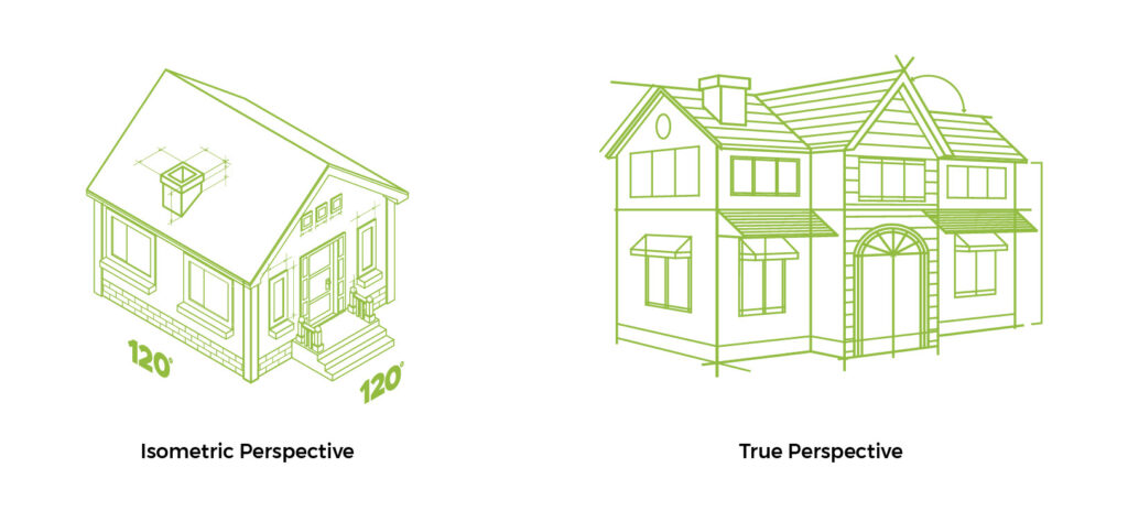
Isometric illustrations represent a three-dimensional object in two dimensions. This is very different from the traditional true perspective method that relies on using one or more vanishing points to create three-dimensional objects to scale.

In the isometric example above, where an object is located in relation to another object does not affect its scale. As the windows on the isometric view of the house get further away, they remain the same size as the other windows in the image. That’s because isometric viewpoints can only exist at a 120-degree angle between the x, y and z-axes, making all three sides equal. With all sides equal, the lines do not converge and instead stay parallel. This keeps the ¾ perspective in place throughout the entire illustration.
What makes Isometric Illustrations Engaging and Effective?
There are a number of illustration styles available to graphic designers, each with their own benefits. Flat illustrations once dominated the digital landscape but are now sharing digital real estate with granular gradients, skeuomorphism and shadowed surrealism.
In today’s digital landscape, though, no style is more popular than isometric illustrations. That’s because they convey visual meaning quickly and clearly while allowing the viewer to experience a stylistic slice of life.
“[Isometric illustrations] evoke the beauty of flat design but with an added depth and dimension that makes each element more visually appealing and easier for the user to understand.” – Carrie Cousins, Design Shack[1]
In the recent past, isometric illustrations have evolved to include various styles, including exaggerated shadows, line drawings, monochromatic colors and even granular gradients to further the visual appeal while still maintaining their ability to be understood in an instant.
Below are some fun examples of today’s isometric illustrations.
Alphaputt is an isometric animated golf game for lovers of typography and golf.

90’s Gadgets by animator Guillaume Kurkdjian bring the Handycams and portable CD players of the grunge and hip hop era back to life.

In City Scape, Coen Pohl creates fictional isometric cityscapes for fun and for sale as prints.

What Makes Isometric Illustrations a Great Choice for Businesses?
Isometric illustrations can be a tangible and authentic way of communicating your brand’s values, product, strategy, step-by-step information and so much more. Depending on a company’s messaging needs, the methods of application are endless.
Infographics
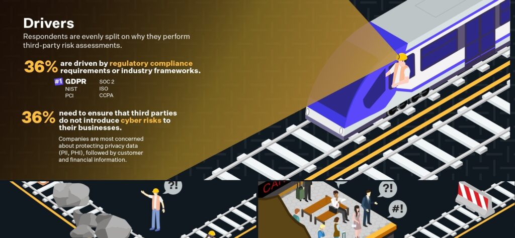
The design team here at Ridge Marketing recently featured isometric illustrations in an infographic and white paper for Prevalent, a risk management software company. Using the third rail of a subway system as a metaphor throughout, the isometric illustrations highlight the drivers, challenges and hazards that businesses face in managing vendor risk.

Web Design
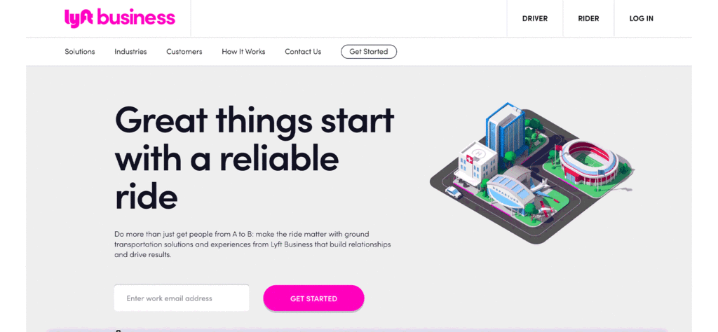
The Lyft Business website utilizes an isometric animation that helps visualize the easy and efficient transportation solutions they offer. Each building is representative of an industry type and is marked with Lyft’s familiar pink color. What ties this all together is that we see an animated car whip around the neighborhood with ease, making stops at all of the marked destinations.

Video
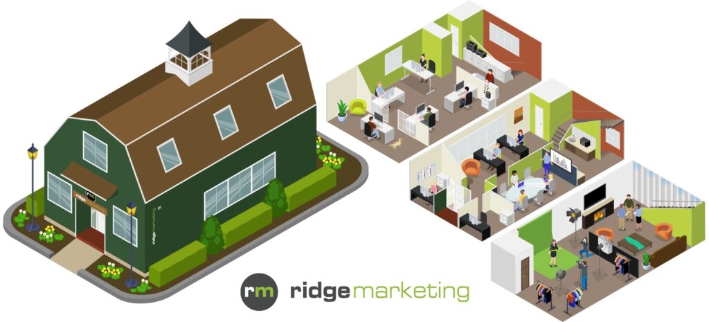
Ridge Marketing collaborated with Brother International to create a series of videos that leverage isometric illustrations. Our video production team chose this style to showcase multiple locations within a typical business office in one image. The workers towards the back of the image are the same size as the people at the front of the image, making transitions across the workspace seamless and consistent
Interactive Experiences
We love isometric illustrations so much that we’re developing an interactive experience that introduces our agency’s various departments to clients, friends and prospects, while showing off our interactive experience capabilities. The viewer will follow Finley dog, our chief barketing officer, as he explores our barn offices and checks on what each team member is working on.

Isometric Illustrations are Here to Stay
As readers skim digital content, it’s important to have visuals that engage and inform. Isometric illustrations equip businesses with a unique perspective for communicating how their products and services work.
Isometric illustrations are an effective tool to create an impressive visual impact and achieve your messaging needs. Because this illustration method is so flexible in terms of style and approach, there’s really no end to what you can use it for. Connect with us to discuss whether isometric illustrations are right for your brand.
[1]https://designshack.net/articles/trends/isometric-design-illustration/

