When the ESE Carbon Company approached The Barn of Brands for support, we jumped at the opportunity to put both our B2B and B2C marketing skills to work. More than a simple branding and web design project, this was a multi-faceted undertaking for two very diverse arms of one company.
The ESE Carbon side of the business is primarily B2C-focused, targeting vehicle owners with the first and only fully carbon fiber wheels for the U.S. automotive aftermarket. Tesla owners were the primary target audience initially, with wheels for additional vehicles being added over time. There was, however, also an element of B2B marketing, as ESE wanted to attract automotive vehicle manufacturers interested in offering carbon fiber wheel options.
The ESE Industries division is completely B2B-focused, designing and manufacturing carbon fiber parts and prototypes for a variety of applications and industries, including aerospace, military, marine, robotics, and even sporting goods.
The company was facing a few challenges:
- They had two separate websites that were very similar in content and design
- Both websites were difficult to update
- The site load speeds were lagging
- The sites weren’t ranking high in search or generating much traffic
- Calls to action weren’t clear or simple
- Contact forms weren’t feeding into their CRM
- The messaging, key benefits and differentiators were muddy
These obstacles made it difficult to attract new leads and convert them into customers. ESE wanted our help to get the right prospects to the right website and then speak to each audience’s specific needs.
ESE Carbon: The B2C Website
We started with the “wheels” website; an e-commerce site targeted to vehicle owners who want to buy carbon fiber rims. This B2C website needed a very visual, luxury appearance to promote high-end E2 carbon fiber wheels in a way that would appeal to savvy Tesla owners.
Ridge Marketing’s comprehensive messaging and website design process included:
- Messaging and brand story development
- Interviewing Tesla owners to understand what motivates them
- Website and collateral content writing
- SEO keyword research and cornerstone page planning
- Sitemap and wireframe design
- Website design mockups – including desktop, tablet and mobile
- Development in a content management system (CMS)
- Testing, QA and launch
- Site promotion via search, paid advertising and social
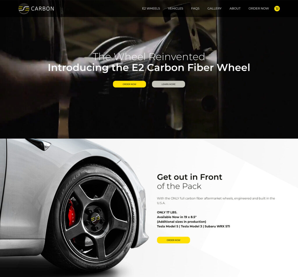
Because Tesla owners were the initial target audience, the new site design took inspiration from sites like Tesla.com. Some of the new website elements included:
- Repurposed story-telling video headers
- Larger, animated callouts of unique features
- Animated graphics and videos that call out features
- Longer, scrolling pages with more comprehensive content
- New custom photography
- Carbon fiber background elements throughout the site

Home Page

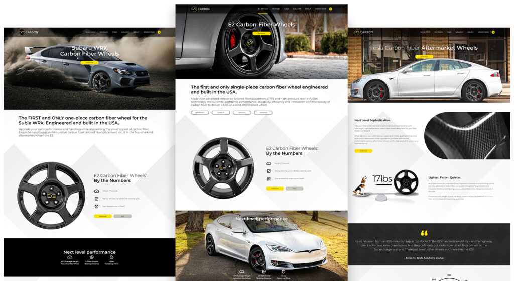
We also created landing pages specific to the vehicles that wheels are designed for. In addition to being informational, these pages serve an SEO purpose–organically positioning ESE to rank for relevant search traffic online.
The E2 product page was similarly created with a dual role. The designated page for organic search traffic, it is also the landing page for Google and social media ads. The E2 page provides specifics on the wheel’s performance, durability, efficiency and innovation. Each section of that page provides the user with information vital for making a purchasing decision and is capped off with a strong call to action (CTA).

A B2B Approach: ESE Industries
As the parts manufacturing side of the house, ESE Industries has an entirely different audience. This site didn’t need to be quite as flashy, since its visitors are B2B customers who are more concerned with the structural properties of carbon fiber than the beauty or aesthetics of the product.
We began by interviewing ESE customers in aerospace and transportation to understand why carbon fiber components are an attractive solution and what motivated them to choose ESE Industries. Using what we learned, we proposed a layout and design that had informational and educational appeal. This site showcases the depth of ESE’s experience and positions them as the experts in carbon fiber manufacturing. Our goal was to stress the benefits of innovative technology coupled with the convenience of a one-stop shop.
While the two websites are very different, we made sure to leverage some of the visual elements of the “wheels” site for brand consistency.
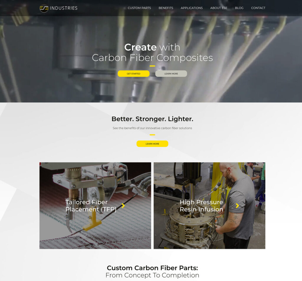
Home Page

Visually, visitors are still greeted with a video header. However, the video doesn’t take up the entire screen. The content is focused on telling a carbon fiber fabrication story. The messaging is solutions- and benefits-focused, while also inspirational.
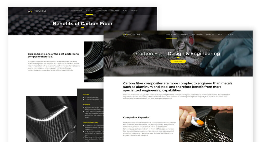
We dove into the innovative technologies that set the company apart and the primary services they provide. The site was architected to provide analytical and engineering-minded users with structured pathways to navigate the content based on their level of expertise and the solutions they’re interested in. The page designs employ a templated structure throughout, making it as easy for users to consume information cleanly and uniformly as they move around the site.
We also created a section that addresses market segments by type of application, allowing users from industries such as aerospace, military, marine and robotics to easily find valuable content specific to their needs. These pages also double as landing pages for digital ad campaigns. They include easy-fill inquiry forms that pass leads through to the sales team and their email marketing database.
Like the ESE Carbon website, we also included several additional pages optimized to attract organic search – taking cues from Google FAQs and keyword phrase research to create topical cornerstone pages.

Click here to see ESE Industries.
The Takeaway
It’s imperative from both a visual and messaging perspective to conduct the research regarding audiences and their key drivers. For ESE, this meant creating separate websites that address two vastly different personas – one that wants to be wooed with beautiful photography and sophisticated design, and one that needs to get to detailed information as efficiently as possible.
Deconstructing and “speaking to” (through words or visual design) B2B and B2C audiences in different but equally engaging ways creates a more impactful user experience. This ultimately helps drive more leads and positions a company with a higher value for their products and brand experience overall.
The results of all of this careful planning and execution have been impressive. ESE Carbon has seen a 600% increase in web traffic, vast improvement in organic keyword rankings, and more than 200 new leads in the first six months.
Are You Trying to Reach Multiple Audiences?
If appealing to vastly different buyer personas has been a challenge for your organization, we’re here to help. Contact us for a plan to turn your unique audiences into loyal customers with digital content and visuals that are crafted for their specific needs.

