We’ve redesigned more than our share of websites over the years, building them to convert prospects to customers as the hub of robust marketing and advertising campaigns. That experience (and a lot of A/B testing) has taught us what works and what doesn’t when it comes to turning websites into reliable lead-gen machines.
Below are five things you can do to your website to make them more effective – before you invest in driving more prospects to it
Do These 5 Things Now…
1. Be Clear About What You Offer
When a prospect arrives at your website, they’re usually looking to solve a problem. Your first job is to tell them how your company can solve their challenges (what you offer). Then you need to help them envision a happy outcome (what they’ll get).
Example of clear and concise messaging:

No one wants to spend mental energy wading through fluff sentences that talk about how long you’ve been in business or your commitment to your customers. If they can’t understand what you provide, how it will help them and how to get started – within a few seconds of skim reading – they will move on.
Be direct, concise and action-oriented in your wording and help visitors quickly understand what they’ll get if they spend their money with you.

2. Write From the Perspective of the Customer
We all want to feel understood, and we all see ourselves as the hero of our own story. Companies that brag about themselves or try to be everything to everyone don’t make a prospect feel understood. Always remember to make your prospects and customers the center of the story on your website and write from their point of view. Think about the challenges they face and the outcomes they want and deserve, and use language that tells them you relate and can solve those challenges.
3. Validate Why They Should Trust you
Once a prospect understands what you offer and sees that you understand their needs, they’re likely to begin looking for reasons to believe in your company. We recommend including content somewhere on every page that quickly validates that you are a reputable company. Logos from clients or partners, certifications, awards, ratings, or associations that you belong to are all effective validators. Testimonials or reviews from customers are also an effective way to verify your positive impact on others.
Example validators:

4. Help Them Envision the Outcome
Now that you’ve validated they can trust your company at a high level, prospects will wonder what happens next. Outline a simple process plan that explains what you’ll do if they fill out your contact form.
Keep your process to three or four steps at most – even if that’s a slight oversimplification. This is marketing, after all. For example:
- Give us some brief info
- We’ll demo our solution
- We’ll get you up and running within X days
Place a call to action button that leads to a contact form near this process plan. It’s also a good idea to display results that you’ve achieved for other customers near the process plan, such as statistics or case studies, to reinforce that filling out the form is the right thing to do.
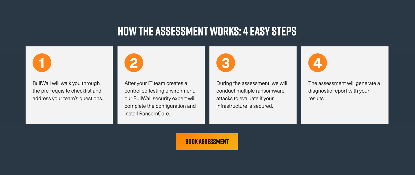
Example process plan:

5. Give Them a Reason to Contact You
Most B2B websites have calls to action (CTAs) for prospects who are ready to engage, such as contact or request-a-quote forms. However, B2B sales cycles often take months or even years – especially when the products or services they are considering are costly or complex.
The data backs this up. According to a survey by Forrester, B2B buyers engaged in an average of 27 interactions with a vendor while making a purchase decision in 2021. This data highlights the importance of offering helpful content that prospects can download during their research phase.

“Soft” CTAs, like guides, eBooks, whitepapers, solution briefs and demos, establish your company as thought leaders and help answer your prospects’ questions – without asking them to commit to a sales call.
According to Marketing Charts, 52% of buyers say they are more likely to buy from a vendor after reading its content.

“Gating” some of these assets behind forms allows you to collect contact information and follow up with email newsletters (and eventually sales calls) to build a relationship with the prospect. Just remember to keep your forms short and the content helpful rather than overly sales-y. Lastly, consider adding a chat feature to your website, as Gartner predicts that chatbots will become the primary customer service channel for about a quarter of organizations by 2027.
It’s Time to Transform Your B2B Website Making your B2B website more effective can feel daunting, but the formula is simple when you remember human nature. Be clear about your offerings, write from the customer’s POV, validate their trust and help them envision a happy outcome. Then, give them reasons to engage – even if they aren’t ready to fully commit.
If you’d like help transforming your B2B website into a lead-gen machine, don’t hesitate to contact the B2B digital marketing experts at Ridge Marketing.

